Note: This guide covers key principles of OOH performance. To move from theory to results and get objective, pre-flight data on your designs, run a free billboard test with Ad Corrector now.
Design Billboards That Convert: The 6-Second Rule Explained
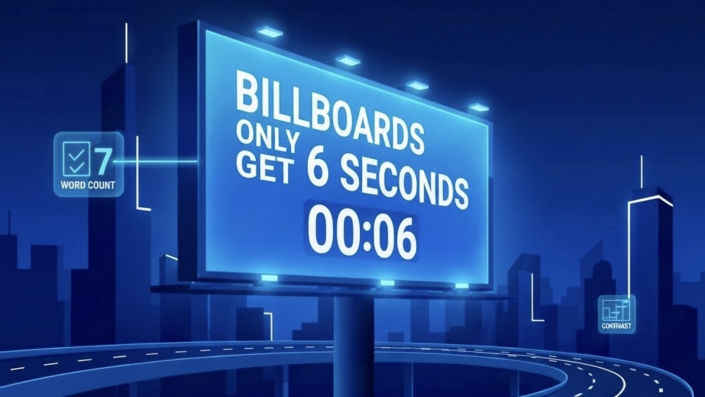
You just spent $5,000 on a billboard campaign. Drivers are flying by at 65 mph. You’ve got six seconds to make your point.
Will they remember your brand, or forget it before the next exit?
That’s the reality of billboard advertising. Unlike digital ads that can be paused or replayed, billboards live in constant motion. Your audience is driving, distracted, and moving fast. You get one shot, and it lasts about six seconds.
In this article you’ll learn how to design billboards that actually work within that narrow window of time, making them readable, memorable, and built to convert at highway speed.
What You'll Learn:
• Why the 6-Second Rule Exists, and the science behind it
• The four core design principles for instant readability
• Real billboard examples that work, and ones that don’t
• Common mistakes that drain your ad budget
• How to test your billboard before it goes live
• Why the 6-Second Rule Exists, and the science behind it
• The four core design principles for instant readability
• Real billboard examples that work, and ones that don’t
• Common mistakes that drain your ad budget
• How to test your billboard before it goes live
Why 6 Seconds Matters for Billboards
The 6-second rule is based on research focused on attention spans and driving behavior.
Recent studies show that billboards generate up to 55% brand recall when designed correctly, compared to just 21% for digital banner ads. But this only works if your message is instantly readable. A confusing or cluttered billboard gets ignored, and your advertising dollars are wasted.
- At 65 mph, a car travels 95 feet per second. Drivers are covering ground fast while trying to read your message.
- The average glance at a billboard lasts 5-10 seconds, including the time it takes to notice the billboard, read it, and process the information.
- Drivers can only safely take their eyes off the road for 2-3 seconds at a time. In that brief time they are split between looking back at the road and your message while they pass by your billboard.
- By the time they've read your message, they've already traveled about 400 ft. If your billboard takes more than 6 seconds to understand, the driver is already gone mentally and physically.
Recent studies show that billboards generate up to 55% brand recall when designed correctly, compared to just 21% for digital banner ads. But this only works if your message is instantly readable. A confusing or cluttered billboard gets ignored, and your advertising dollars are wasted.
People usually look at a billboard for around six seconds, which is often enough time to capture attention if your message is clear.
6-Second Rule: 4 Design Principles
After analyzing many successful billboard campaigns, four principles consistently emerge. These are the requirements if you want your billboard to perform.
1. Keep It Simple: The 7-Word Rule
If drivers can read 7 words or fewer in 6 seconds, that's your limit. Any more than that, and you're asking them to spend too much time reading instead of driving.
Examples that work:
Examples that don't work:
Pro tip:
If you can't explain your offer in 7 words, you don't have a clear offer. Simplify your message before you design anything else.
Examples that work:
- "Exit 42. Best Burgers in Texas."
- "Divorce? We Can Help. Call Now."
- "5 Miles. Coffee. Hot Showers."
Examples that don't work:
- "Visit Our Newly Renovated Family-Friendly Restaurant Featuring Farm-to-Table Ingredients"
- Long URLs, detailed addresses, or multiple phone numbers
- Paragraphs of legal disclaimers or complex explanations
Pro tip:
If you can't explain your offer in 7 words, you don't have a clear offer. Simplify your message before you design anything else.
2. High-Contrast Colors
Your billboard needs to be readable in bright sunlight, at dusk, in rain, and from hundreds of feet away.
Best high-contrast combinations:
Avoid these combinations:
Research shows that high-contrast billboards can be read from up to 500 feet away, while low-contrast designs might only be legible from 100-150 feet, dramatically reducing your effective impressions.
Best high-contrast combinations:
- Black text on yellow background (highest visibility)
- White text on black background
- Black text on white background
- Dark blue on white
- White on dark red
Avoid these combinations:
- Light text on light backgrounds (cream on white, light blue on gray)
- Similar color tones (blue on purple, red on orange)
- Too many competing colors (rainbow gradients, busy patterns)
Research shows that high-contrast billboards can be read from up to 500 feet away, while low-contrast designs might only be legible from 100-150 feet, dramatically reducing your effective impressions.
3. Large Image, Clear Message
Your billboard should communicate one idea. Not two. Not three. JUST ONE. Think of your billboard like a sentence: it should have one subject (your product/service) and one action (what you want people to do).
The ideal formula:
What to avoid:
Remember: drivers won't remember everything on your billboard. Make sure the one thing they do remember is the most important thing.
The ideal formula:
- One dominant image that takes up 60-70% of the billboard
- One headline (7 words or less)
- One call-to-action (your website, phone number, or next exit)
- Your logo (keep it small and subtle, let your message do the work)
What to avoid:
- Multiple images competing for attention
- Long lists of products or services
- Multiple phone numbers, websites, and social media handles
- Complex infographics or charts
Remember: drivers won't remember everything on your billboard. Make sure the one thing they do remember is the most important thing.
4. Bold Typography
Your font choice can make or break your billboard. Fancy script fonts might look elegant on a wedding invitation, but they're invisible at 65 mph.
Best font choices for billboards:
Fonts to avoid:
As a general rule, your text should be at least 3 feet tall for every 100 feet of viewing distance. For a highway billboard viewed from 500 feet away, that means your main headline should be at least 15 feet tall.
Best font choices for billboards:
- Sans-serif fonts:
- Bold weights:
- Tall letterforms:
Fonts to avoid:
- Script or cursive fonts (illegible at highway speeds)
- Decorative or ornate typefaces
- Condensed or narrow fonts (hard to read quickly)
- All caps in long sentences (slows reading speed)
As a general rule, your text should be at least 3 feet tall for every 100 feet of viewing distance. For a highway billboard viewed from 500 feet away, that means your main headline should be at least 15 feet tall.
Test Your Billboard Design
Want to see how your billboard performs at highway speeds?
Test your design's readability in seconds with our free billboard analysis tool.
Get a grade (A-F), performance scores, speed simulation, and heatmap analysis.
Visit adcorrector.com to test your design free.
Billboards That Work, and Ones That Don't
Let's look at an few examples to see these principles in action.
Example 1: The Effective Billboard
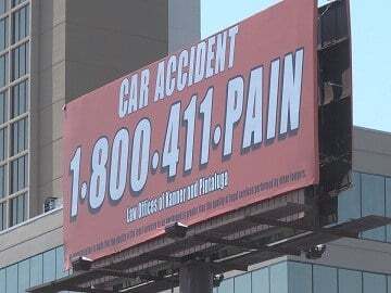
Copy: Car Accident 1-800-411-PAIN
Design: Bold red phone number on a clean white background with minimal supporting text.
Why It Works:
• The number is the brand, it's instantly memorable.
• Red text creates strong contrast and commands attention.
• Minimal layout eliminates distraction and boosts legibility.
• Drivers can read and remember it in seconds, even at speed.
Example 2: The Ineffective Billboard
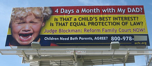
Copy: 4 Days a Month with My Dad? Is THAT a CHILD’S BEST INTEREST? Is THAT EQUAL PROTECTION OF LAW? Judge Blockman: Reform Family Court NOW! Children Need Both Parents, AGREE? 800-978-____
Design: Multiple fonts and colors (yellow, red, white) with a distressed image of a crying child. Several long sentences stacked closely together, all competing for attention.
Why It Fails:
• Way too much text, no driver can read that much copy in motion.
• Multiple questions fragment the message instead of focusing it.
• Overuse of capital letters and mixed font colors reduces clarity.
• Emotional image, word-heavy layout, focus in opposite directions.
• No single call-to-action stands out; the phone number gets buried.
Ad Corrector Test Results
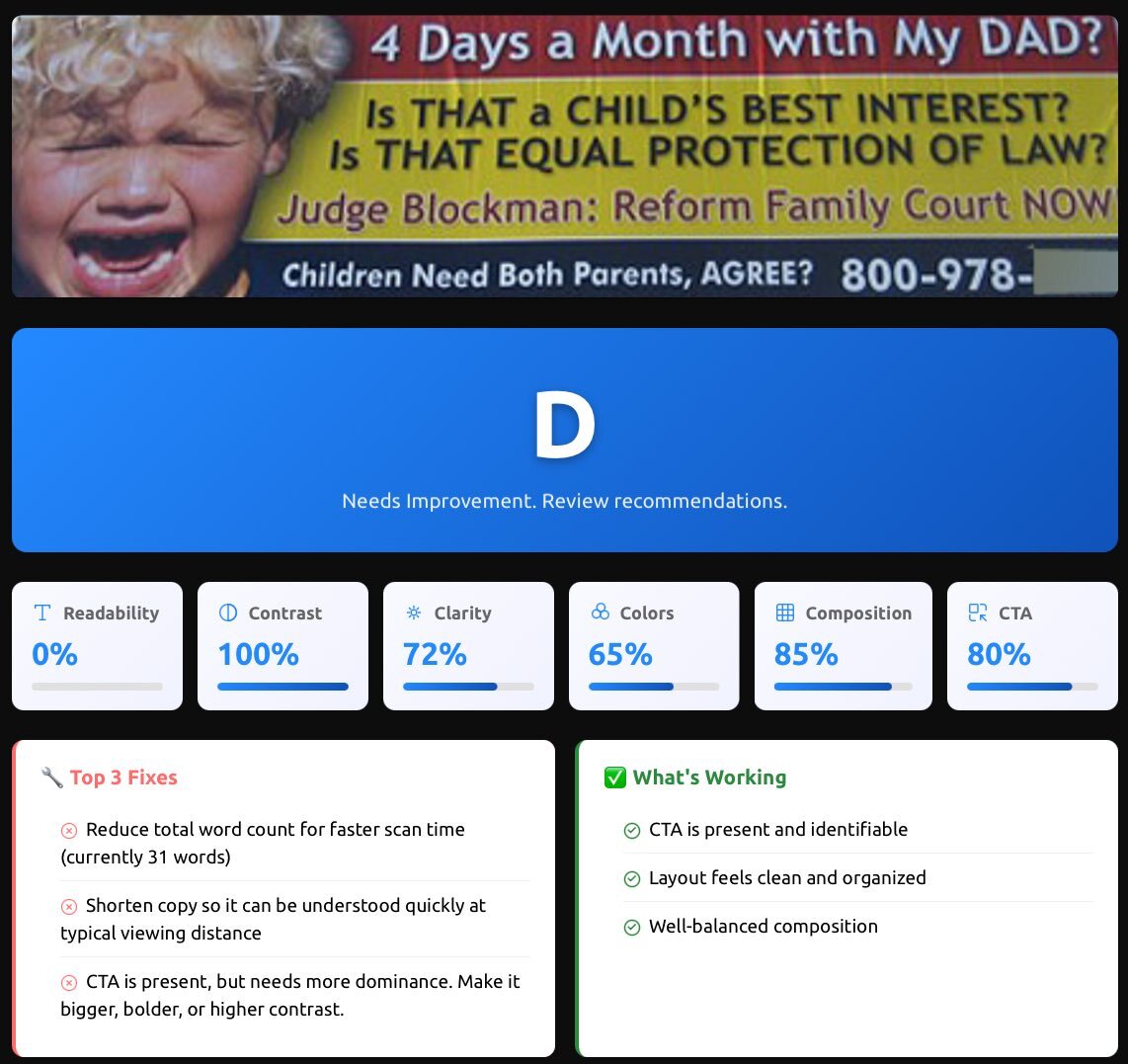
This billboard scored a D for readability. Too much text and visual clutter reduced clarity at speed.
Example 3: The Creative Billboard
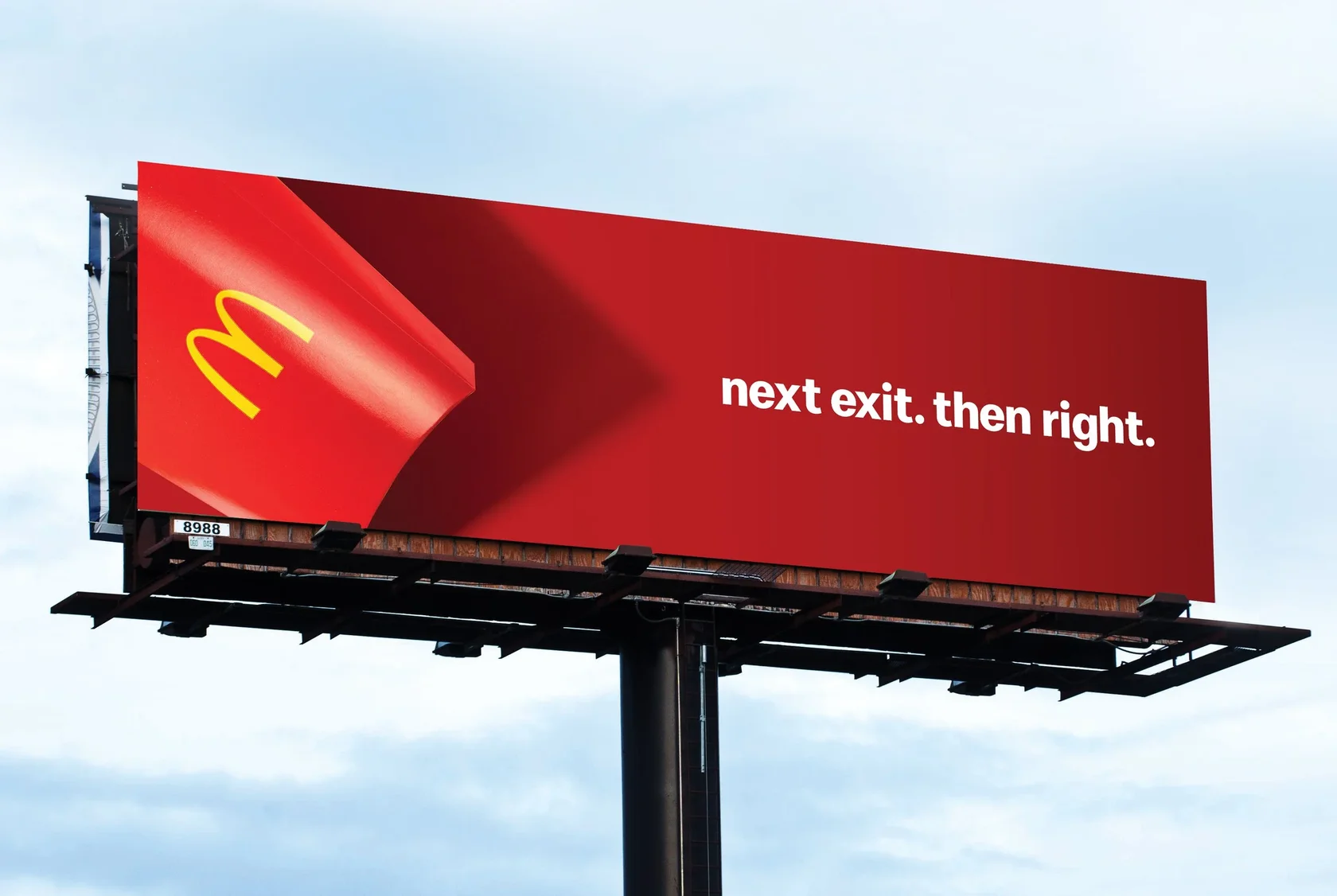
Copy: Next Exit. Then Right → McDonald’s
Design: Large text, simple arrow indicating direction, minimal additional copy, strong brand logo and color contrast.
Why It Works:
• Message is ultra-short and action-oriented, easy to process.
• Direction (“Next Exit. Then Right”) gives immediate context.
• Recognizable logo anchors the message without heavy copy.
• High contrast and clean design ensures the message pops.
The pattern:
Successful billboards share common traits; simplicity, clarity, and immediate comprehension. They don't try to tell your entire brand story; they just give drivers one compelling reason to take action.
Successful billboards share common traits; simplicity, clarity, and immediate comprehension. They don't try to tell your entire brand story; they just give drivers one compelling reason to take action.
5 Common Billboard Design Mistakes
Even experienced marketers make these errors. Here's how to avoid the most common pitfalls:
Mistake 1: Too Much Information
The problem:
Trying to include every service, feature, and benefit on one billboard.
The fix:
Choose ONE compelling message. If you're a restaurant, pick your best dish. If you're a law firm, focus on one practice area. If you're a retailer, promote one irresistible offer.
Mistake 2: Weak Call-to-Action
The problem:
Not telling people what to do next. "Visit us sometime" is not a call-to-action.
The fix:
Be specific. "Next Exit," "Call Now," "Order Online," "Open Sundays." Give people a clear, immediate action they can take.
Mistake 3: Forgetting About Viewing Distance
The problem:
Your design looks great on your computer screen but disappears at 500 feet.
The fix:
Test your design at scale. Stand 20 feet away from your computer screen. If you can't read it clearly, drivers won't be able to either. Use the Ad Corrector billboard testing tool to simulate highway viewing conditions.
Mistake 4: Using Poor Quality Images
The problem:
Pixelated, blurry, or low-resolution photos that look unprofessional when blown up to billboard size.
The fix:
Use high-resolution images (minimum 300 DPI at full size). Professional photography is worth the investment, a blurry billboard makes your entire brand look cheap.
Mistake 5: Ignoring Your Target Audience
The problem:
Designing for your own taste instead of your audience's needs.
The fix:
Consider who's driving on this road, at what time, and what problems they need solved. A billboard near a hospital should look different from one near a beach. Context matters.
How to Test Your Billboard Design Before Printing
Most billboard design failures could have been prevented with proper pre-testing. Don't wait until your billboard is live to discover that drivers can't read it. By then, you've already spent your OOH media dollars on a campaign that is likely to deliver poor results.
The Old Way (Expensive and Risky)
Traditionally, advertisers would:
The problem? Your team is not viewing it from 500 feet away while driving 65 mph. Office feedback doesn't replicate real-world conditions.
The Better Way. Outdoor Ad Pre-testing.
With modern billboard testing you can simulate real viewing conditions:
What to Look For When Testing
Billboard testing should include:
The ROI of testing: Billboard advertising can cost hundreds to thousands per month depending on location. If your design doesn't work, that's money wasted. Spending a few minutes or less testing your design before launch can save you from ineffective advertising.
The Old Way (Expensive and Risky)
Traditionally, advertisers would:
- Design the billboard
- Show it to colleagues or focus groups
- Make subjective decisions based on opinions
- Print and install it
- Hope it works
The problem? Your team is not viewing it from 500 feet away while driving 65 mph. Office feedback doesn't replicate real-world conditions.
The Better Way. Outdoor Ad Pre-testing.
With modern billboard testing you can simulate real viewing conditions:
- Speed simulation:
- Readability analysis:
- Contrast checking:
- Distance viewing:
- Heat mapping:
What to Look For When Testing
Billboard testing should include:
- An overall grade (A-F) for your design
- Performance scores across multiple factors
- Speed view simulation showing what drivers actually see
- Visual heatmap highlighting readability issues
- Specific recommendations for improvement
The ROI of testing: Billboard advertising can cost hundreds to thousands per month depending on location. If your design doesn't work, that's money wasted. Spending a few minutes or less testing your design before launch can save you from ineffective advertising.
Checklist: The 6-Second Billboard Design
Before you send your design to print, run through this checklist:
Your Pre-Print Checklist:
If you can check every box, you're ready for launch.
Your Pre-Print Checklist:
- Word count: 7 words or fewer in your main message
- Font size: At least 3 feet tall per 100 ft. of viewing distance
- Font choice: Bold, sans-serif, choose a highly legible typeface
- Color contrast: High contrast between text and background
- Single message: One clear idea
- One image: Single clear visual element
- Clear CTA: Specific action for viewers to take
- Image quality: High-resolution (300+ DPI)
- Logo placement: Visible but not overwhelming (10-15% of space)
- Viewing distance test: Readable from 20+ feet away on your screen
- Speed simulation: Tested with a billboard analysis or pre-testing tool
- Lighting conditions: Works in daylight, dusk, and bright sun
If you can check every box, you're ready for launch.
The 6-Second Rule in Action
When designing effective billboards focus on being clear and immediate.
5 core principles:
1. Drivers have 6 seconds.
Design for speed
2. 7 words or fewer.
If you can't say it simply, simplify your offer.
3. High contrast wins.
Visibility beats aesthetics every single time.
4. One message only.
Trying to say everything means saying nothing.
5. Test before printing.
Subjective opinions don't predict real-world performance.
Frequently Asked Questions About the 6-Second Billboard Rule
How many words should be on a billboard?
6 to 8 words total for the main message on your standard billboard size. Fewer words usually means faster comprehension, higher retention, and fewer design compromises.
What is the 6-second rule for billboards?
It means your billboard should be understood in about six seconds or less. Drivers are moving, scanning, and filtering information aggressively.
Does the 6-second rule apply to digital billboards too?
Yes, and in some ways it matters more. Digital boards often compete with motion, brightness shifts, and multiple creative rotations. If the first second does not establish the message, the rest of the seconds rarely save it.
What is the biggest reason billboards fail, even when the design “looks good”?
The most common failure is too much competing information. Even with strong contrast and improved baseline readability, the ad can still fail if the viewer cannot instantly tell what matters first. When hierarchy is unclear, attention jumps around, comprehension drops, and the message never forms.
What fonts are best for billboard readability?
Use simple, bold, high x-height sans-serif fonts. Avoid thin weights, decorative styles, condensed letterforms, and anything that relies on “pretty” details.
How do I test if my billboard is readable at highway speeds?
Start with simple reality checks. Shrink the design until it’s about the size of a business card on your screen. If the message breaks, it’s too complex. Step back several feet and see if the headline is instantly clear without effort.
You can also use a billboard analysis tool that simulates speed, distance, contrast, and glance-based viewing to see what drivers realistically process in a few seconds. These tools help identify readability and hierarchy issues before anything goes to print.
What color contrast works best for billboards?
High contrast wins. Light text on dark backgrounds or dark text on light backgrounds generally performs well. Avoid low contrast overlays, gradients behind important copy, and color pairs that blend at distance. Also remember: sunlight, glare, and dirty windshields are real things you are fighting against.
How big should the headline be on a billboard?
Big enough that the headline dominates and can be read without effort. If your supporting copy, logo, or background details are fighting the headline for attention, the headline is not big enough or the layout is not disciplined enough.
Should I include a logo, website, or phone number?
Yes, but keep it minimal. If your audience cannot recall it after a quick glance, it is wasted space. For most billboards: pick one action path, usually a short domain or simple brand name. Phone numbers often underperform at highway speeds unless the format is extremely short and memorable.
OOH Pre-Flight Creative Checklist
Opens in a new tab. Print-ready.

Author: Dan Resnikoff
Related Articles