Note: This guide covers key principles of OOH performance. To move from theory to results and get objective, pre-flight data on your designs, run a free billboard test with Ad Corrector now.
Most Billboards Fail: How to Fix Them
Speed, distance, and attention decide whether an outdoor ad works or fails.

Billboard Readability Is a Real Issue
Even with strong contrast and improved baseline readability, many billboards fail because they are designed for screens, not speed. Drivers do not analyze ads. They glance. If the message does not register instantly, see ya later, it is gone.
After twenty years working in advertising, I can share that most billboards fail for predictable and preventable reasons. A billboard is a high-speed communication device. You have a few seconds to make your message land. When an ad ignores how people actually process information at speed, the entire investment goes to waste.
Below you will find real issues that cause billboards to fail, and what you can do to fix them.
Below you will find real issues that cause billboards to fail, and what you can do to fix them.
Vision and Speed Impact Readability
The Brain Only Processes What’s Quick
- Readability at Speed Is the First Failure Point
Typical readability mistakes:
• fonts that are too thin
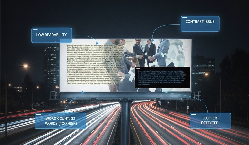
• too many words
• poor contrast against the background
• busy imagery behind the text
• color combinations that wash out at distance
A billboard must hold up against speed, sunlight, distance, and distraction. That means clarity above all else.
Fix:
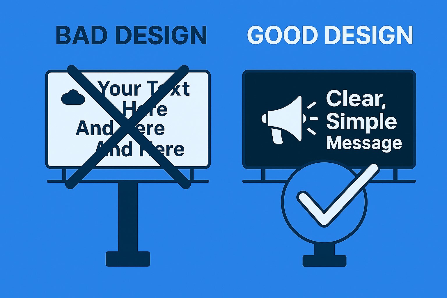
Use strong contrast, bold type, and minimal copy. The message should be readable without effort even if the viewer is not trying.
- Too Many Words
Fix:
Choose one message. One idea. One takeaway.
- Broken Attention Flow
Common issues with Outdoor billboards are:
• headline is too small
• logo is too large
• image is overpowering the text
• call to action is buried
• viewer does not know where to look first
If attention does not flow in the right order, the message never forms.
Fix:
Design with intention. A clean hierarchy looks like this:
Main Message → Supporting Visual → Brand or CTA
- Poor Color Choices
Weak color choices include:
• dark text on dark backgrounds
• light text on light backgrounds
• low contrast image overlays
• gradients that reduce clarity
• colors that blend into each other at distance
Contrast matters, especially when glare, motion, and distance are involved.
Fix:
Choose colors that remain clear at distance, through glare, and at speed.
- No Message Priority
Fix:
Choose a single priority. Every other element supports that priority or does not belong in the ad.

- No Pre-Flight Testing Before the Outdoor Ad Goes Live
Most billboards go from design to production without a final clarity check. Agencies skip this because of deadlines. Small businesses skip it because they do not have a simple way to test their OOH ad (maybe they do not even know anything exists).
A single pre-flight test helps catch:
• text that is hard to read
• improper contrast
• broken attention flow
• clutter
• poor hierarchy
• sizing issues
• background conflicts
Before an outdoor ad goes live, it should pass a reality check. Test your outdoor ads for free with adcorrector.com.
How to Fix These Problems Quickly
Improving a billboard requires simplicity, strong hierarchy, clarity, proper contrast, and understanding how people read at speed.
Ad Corrector is built for this exact purpose. It analyzes readability, visual flow, clarity, and color effectiveness using practical logic developed from years of looking at what actually works and what consistently fails. It is meant to be helpful and straightforward. You upload your ad, get objective observations, and make adjustments before anything goes live.
Reminder:
A billboard is not a canvas for everything you want to say. It is a fast interaction where you earn a split-second of attention. When you design for that reality, your ads become significantly stronger. Most billboard failures are completely avoidable. Clarity wins every time. If you want to test one of your ads, you can use Ad Corrector for free. It simple, fast, and designed to help you catch the issues that matter most.
Visit adcorrector.com to analyze your outdoor ads for free.
Frequently Asked Questions About Billboard Design
- Bill Board:What makes a billboard readable at highway speeds?Ad Corrector:A billboard is readable when its main message can be understood in under three seconds. This requires large text, strong contrast, minimal words, and a clear visual hierarchy that works at speed and distance.
- Bill Board:How many words should a billboard have?Ad Corrector:Most effective billboards use seven words or fewer. More than that increases cognitive load and reduces comprehension, especially when drivers are moving quickly.
- Bill Board:Why do most billboards fail?Ad Corrector:Most billboards fail because they are designed for screens, not real-world driving conditions. Common issues include too much text, weak contrast, poor hierarchy, and layouts that require effort to understand.
- Bill Board:Does contrast matter more than color in billboard design?Ad Corrector:Yes. The human brain detects contrast before it processes color. High contrast between text and background is far more important than stylish color choices, especially in bright light or motion.
- Bill Board:How long do drivers actually look at billboards?Ad Corrector:Drivers typically glance at a billboard for three to five seconds, with meaningful attention occurring in the final second before passing. If the message is not immediately clear, it is missed entirely.
OOH Pre-Flight Creative Checklist
Opens in a new tab. Print-ready.

Author: Dan Resnikoff
Related Articles