What Is Luminance Contrast Ratio?
Definition: Luminance Contrast Ratio is a mathematical measurement of the difference in light intensity (brightness) between the foreground of an image (usually text) and its background. It is expressed as a ratio ranging from 1:1 (no contrast, invisible) to 21:1 (pure black on pure white).
While color contrast relies on hue (Red vs. Blue), luminance contrast relies purely on light values. This is the single most critical factor for legibility in outdoor advertising.
While color contrast relies on hue (Red vs. Blue), luminance contrast relies purely on light values. This is the single most critical factor for legibility in outdoor advertising.
Why It Matters for Outdoor Advertising (OOH)
In digital design (websites, apps), a contrast ratio of 3:1 is often considered acceptable for large text. In Out-of-Home (OOH) advertising, a 3:1 ratio is illegible.
Outdoor environments present optical challenges that computer screens do not:
• Solar Glare: Direct sunlight washes out color saturation, leaving only luminance values visible.
• Distance: As viewing distance increases to 500+ feet, the eye struggles to separate colors of similar value (e.g., red text on a blue background).
• Speed: Viewers traveling at 65 mph (104 km/h) have less than 200 milliseconds to decode a character. Low contrast increases cognitive load, causing the brain to skip the message entirely.
The Industry Standards
• 1:1 to 3:1 (Fail): The text is indistinguishable from the background at distance.
• 3:1 to 5:1 (Risk): Legible on a monitor, but risky for billboards. Likely to disappear in bad weather or direct sun.
• 7:1 (Safe): The ISO and WCAG standard for "enhanced contrast." This is the minimum target for roadside billboards.
• 15:1+ (Optimal): High-impact combinations like Black on Yellow or White on Dark Blue. These maximize retinal acuity.
The Physics of "Vibration"
A common mistake in billboard design is using complementary colors with similar luminance values (e.g., bright red text on a bright green background).
While these colors are "opposites" on the color wheel, they often have identical light reflectance. When viewed at a distance, the eye cannot determine which color is closer. This creates a visual phenomenon called chromostereopsis, or "visual vibration." The text appears to shake or blur, making it physically painful to read.
While these colors are "opposites" on the color wheel, they often have identical light reflectance. When viewed at a distance, the eye cannot determine which color is closer. This creates a visual phenomenon called chromostereopsis, or "visual vibration." The text appears to shake or blur, making it physically painful to read.
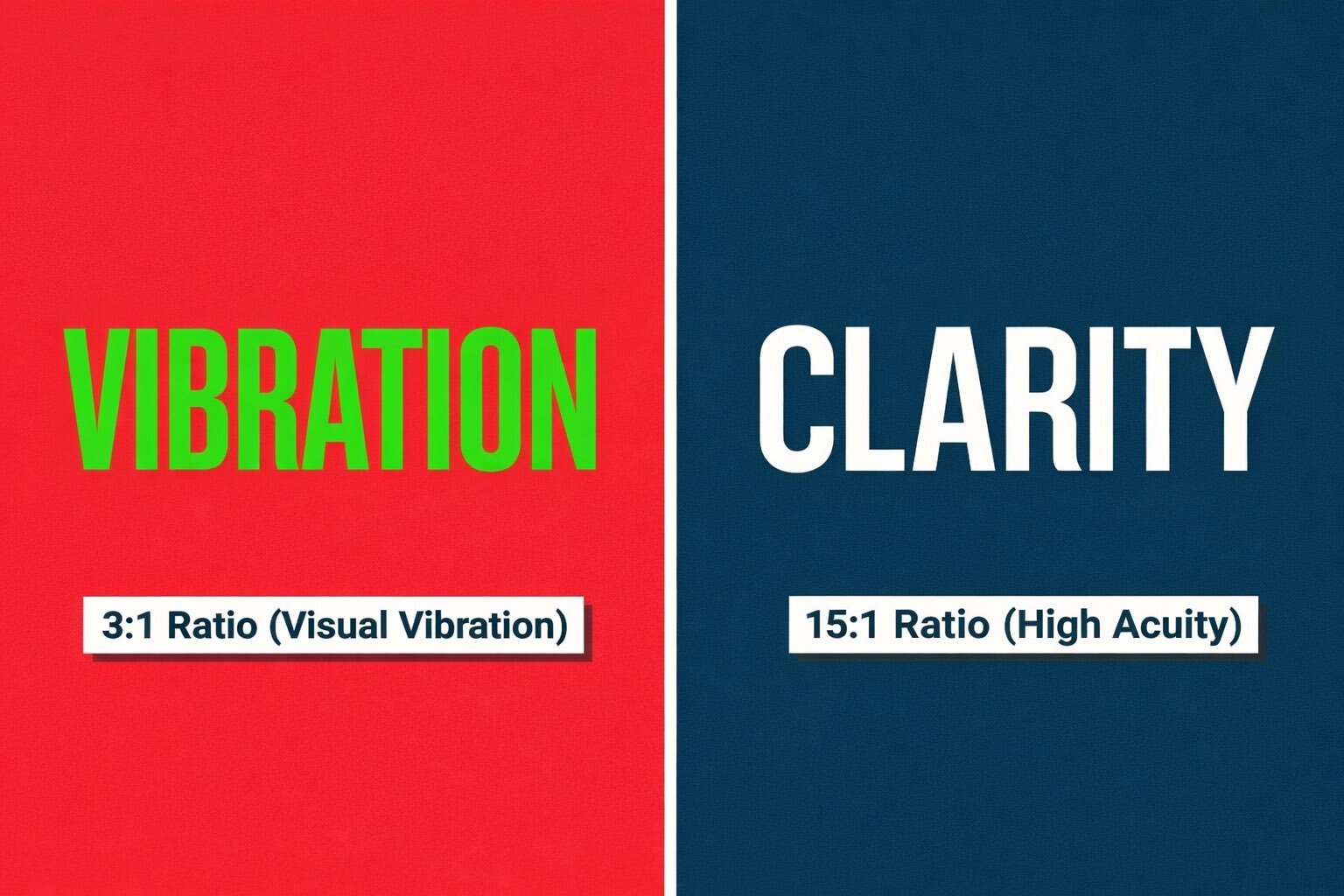
The Fix: Always ensure one color is significantly darker (lower luminance) than the other.
How to Calculate Your Ratio
You cannot judge contrast with the naked eye on a backlit computer monitor. Your screen is calibrated to make colors look good, not to simulate outdoor lighting conditions.
Ad Corrector uses a luminance algorithm to analyze your design file pixel-by-pixel. It converts your colors to grayscale values and calculates the mathematical ratio between your primary text and the background.
• If your score is under 50%: Your contrast is likely too low for highway viewing.
• If your score is over 80%: Your design has sufficient "pop" to be read at 600 feet.
Ready to Test Your Billboard Design?
Don't let low contrast kill your campaign.
Download the Pre-Flight Checklist.
Opens in a new tab. Print-ready.

Author: Dan Resnikoff