This Outdoor Ad Breaks the Rules, But It Still Scores a B
At first glance, this feels like it should fail. Too much information. Too many zones. Too many chances for the eye to lose time. But when tested under real viewing constraints, the core structure holds. The ad is not "broken". It is inefficient. And that difference is exactly why it earns a B instead of collapsing.
TL;DR
- This ad breaks common OOH rules, yet maintains functional hierarchy at speed.
- A B grade means the message registers, but time and efficiency are being lost.
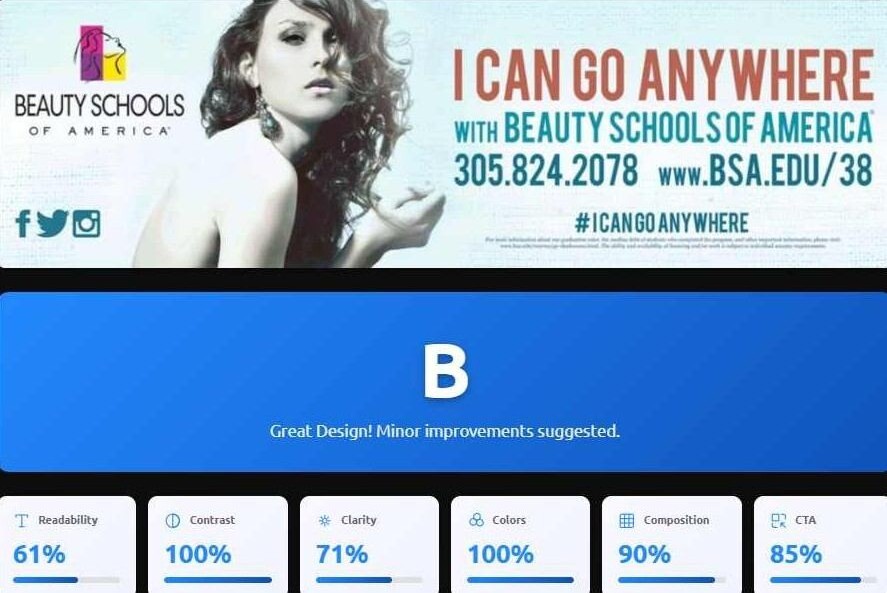
- Readability is the main drag (61%), not contrast, composition, or CTA strength.
- Clarity (71%) and persuasion (88/100) explain why it works better than it looks.
- Reducing word count and increasing CTA dominance could push this toward an A.
What people think the rules are
You have heard these before, and they are incomplete when treated as religion.
- Keep copy minimal
- One message only
- One clear CTA
- No extra details
- Do not make viewers work
What this example proves
This creative breaks multiple rules and still gets a B because the primary structure is strong enough to survive at speed.
It looks like a D because it feels busy. But the hierarchy still registers quickly. Therefore this is a functional ad with avoidable processing drag.
Step 1: The creative, as tested
First, look at the ad as it exists in the real world. This matters because outdoor creative lives and dies by what survives in motion.

Step 2: Why it feels like a D
Your brain is not wrong to distrust it. This creative includes multiple competing tasks for a viewer with limited time, increasing processing load. More text means more opportunities for the message to collapse into “I’ll deal with that later.” And later never comes.
- Too many information zones
- Too many micro messages
- Secondary details compete with the main idea
- Requires longer processing time than most placements allow
- High contrast headline layer
- Clear “top layer” hierarchy
- Strong focal anchor (image)
- Brand presence is not hidden
Step 3: Speed View tells the truth
Speed View is a reality check. It asks, “What survives long enough to register anything meaningful.”

This ad is not “fast.” But the top layer is strong enough to survive a glance. Therefore the grade lands in B territory instead of D territory.
Step 4: Attention Heatmap explains the B
The heatmap shows where attention is pulled first and where it bleeds away. This helps explain why some “busy” ads still perform better than expected. The design has an anchor holding the system together.

Step 5: The score breakdown, interpreted correctly
A "B" grade here means the ad functions clearly, but wastes time. The scores show exactly where: readability lags (61%) while Color Harmony (100%), contrast (100%), and composition (90%) keep the message alive.
- The core message registers
- The structure holds under motion
- The ad is not invisible
- The emotional signal is strong and immediate
- That every detail is readable
- That it is “best practice”
- That it is maximized for response
Step 6: Persuasion Engine adds the emotional layer
The Persuasion Engine does not promise outcomes. It highlights the persuasion signals the creative is likely sending. This is how a creative can feel emotionally clear in the first second while still leaking time during detailed processing.
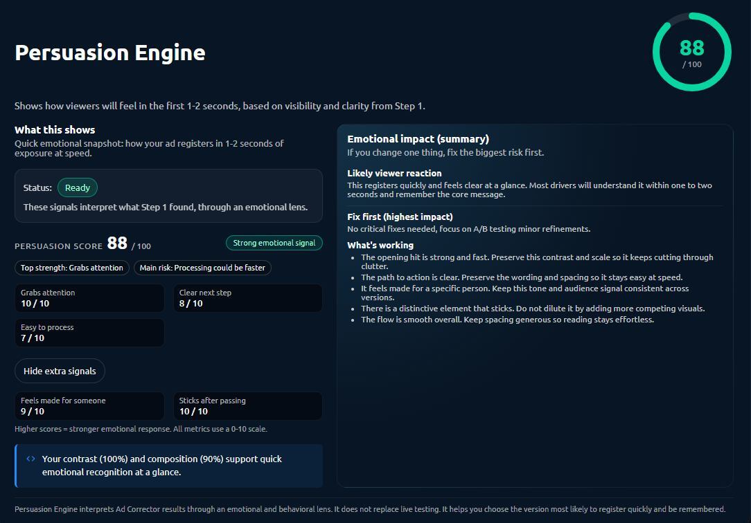
Some people expect persuasion to equal readability. But persuasion can happen at the top layer while details fail. Therefore the correct move is to simplify, not to redesign the entire concept.
So why is it a B, not a D
Because the creative has structural clarity and emotional pull, even with excess information. It has an anchor, a readable top layer, and enough contrast to survive motion. It is busy, but it still functions.
- Contrast and hierarchy register fast
- Primary layer survives speed viewing
- Attention clusters instead of scattering
- Processing time is too long
- Secondary elements compete
- CTA and details are not dominant enough
What to do if this is your creative
Tighten it, keep the anchor, keep the contrast, and keep the top layer. Then, remove friction.
- Reduce total word count
- Make one message dominant
- Increase CTA dominance
- Contrast
- Primary hierarchy
- Strong focal anchor
